TWG/UpHabit Inc
2017-2019
2017-2019
Overview
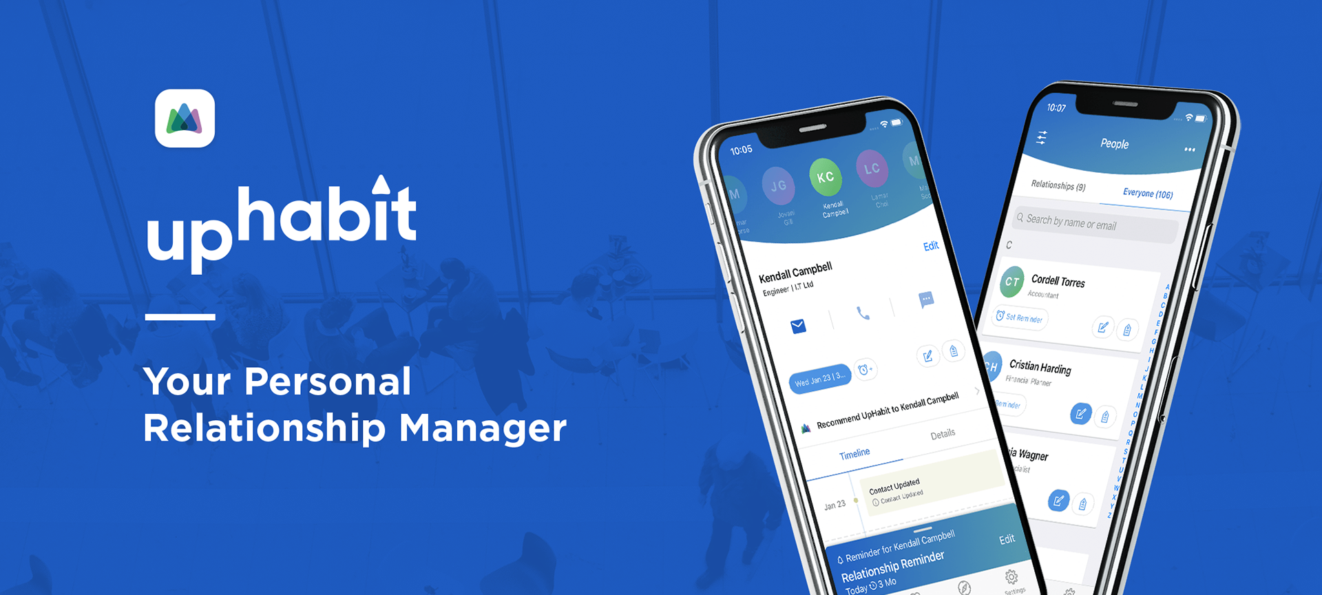
UpHabit acts as a "personal CRM"; a place to manage and nurture contacts in your network, whether they are colleagues, friends, or family.
UpHabit acts as a "personal CRM"; a place to manage and nurture contacts in your network, whether they are colleagues, friends, or family.
As the sole product designer on the UpHabit team, I was tasked with improving many of the current features of the iOS and Android applications, design future features, lead user research sessions, and assist in future roadmap planning.
Notable App features
- Ingest contacts from multiple email accounts and address books
- Sort contacts by last contacted date
- Log and document interactions with your contacts, including notes about your conversations and how you connected with them
- View your historical interactions with a contact on a timeline
- Schedule reminders to reach out to your top contacts
- Tag contacts, group email/text contacts that share the same tag
- Merge contacts that shared similar information
- Store contacts across multiple devices
- Multi-tier subscription service
Research Methods
Making design decisions that incorporate user data is extremely important, especially in early-stage startups. We gathered data primarily through in-depth user interviews, usability testing, and surveying. Working with my Product Manager, we often analyzed analytic data to see if changes to features made an impactful difference.
Making design decisions that incorporate user data is extremely important, especially in early-stage startups. We gathered data primarily through in-depth user interviews, usability testing, and surveying. Working with my Product Manager, we often analyzed analytic data to see if changes to features made an impactful difference.
Solution
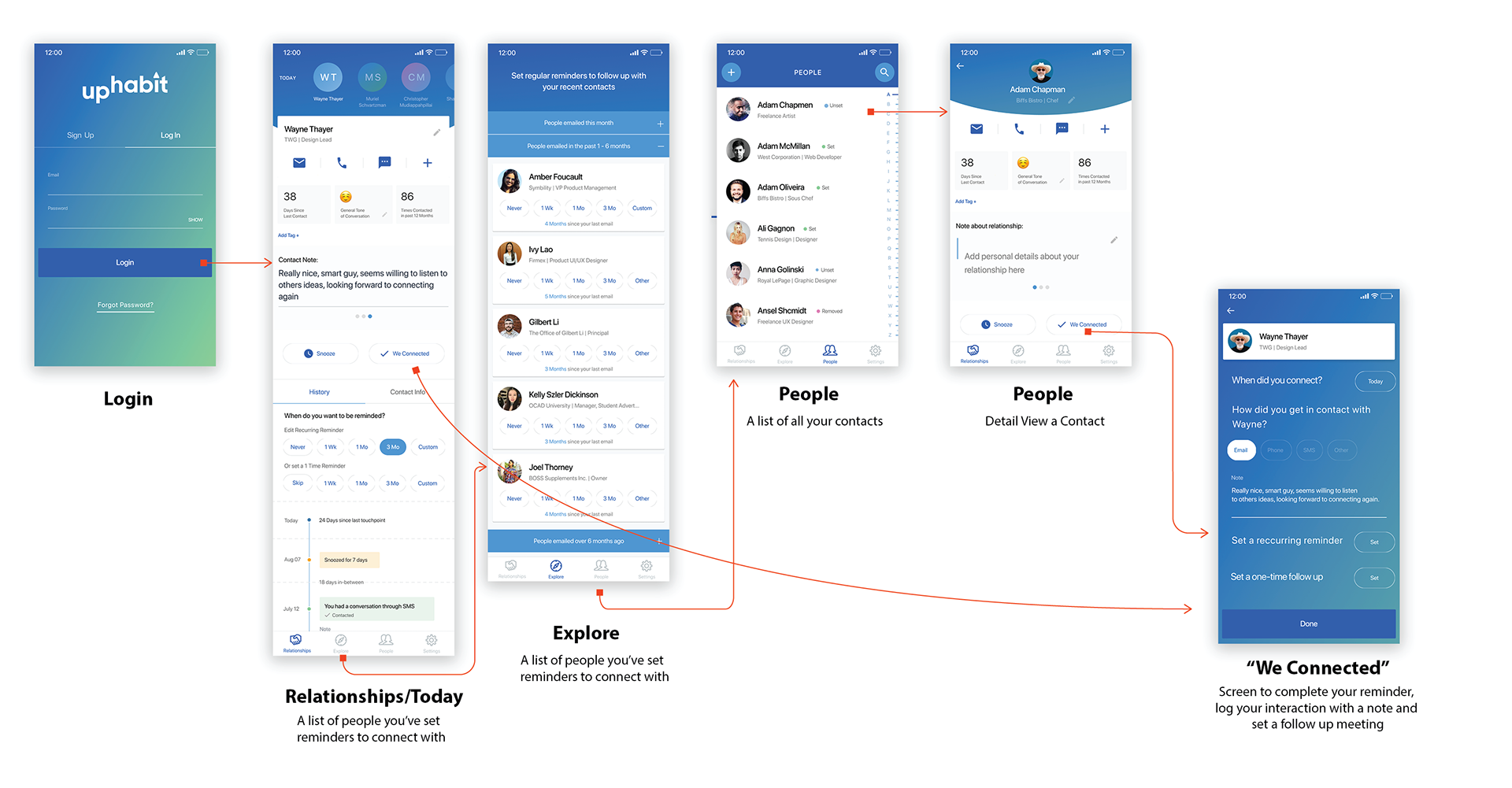
User flow of the main features of the initial version of Uphabit
Notable user pain points
The onboarding experience was unclear and asked for too much
There were a number of areas of the onboarding experience that needed to be improved. Creating an account required a user to fill out too many unnecessary form fields which increased bounce rate and many users were concerned with why we needed to collect this information in the first place ex. "Why do you need my phone number?"
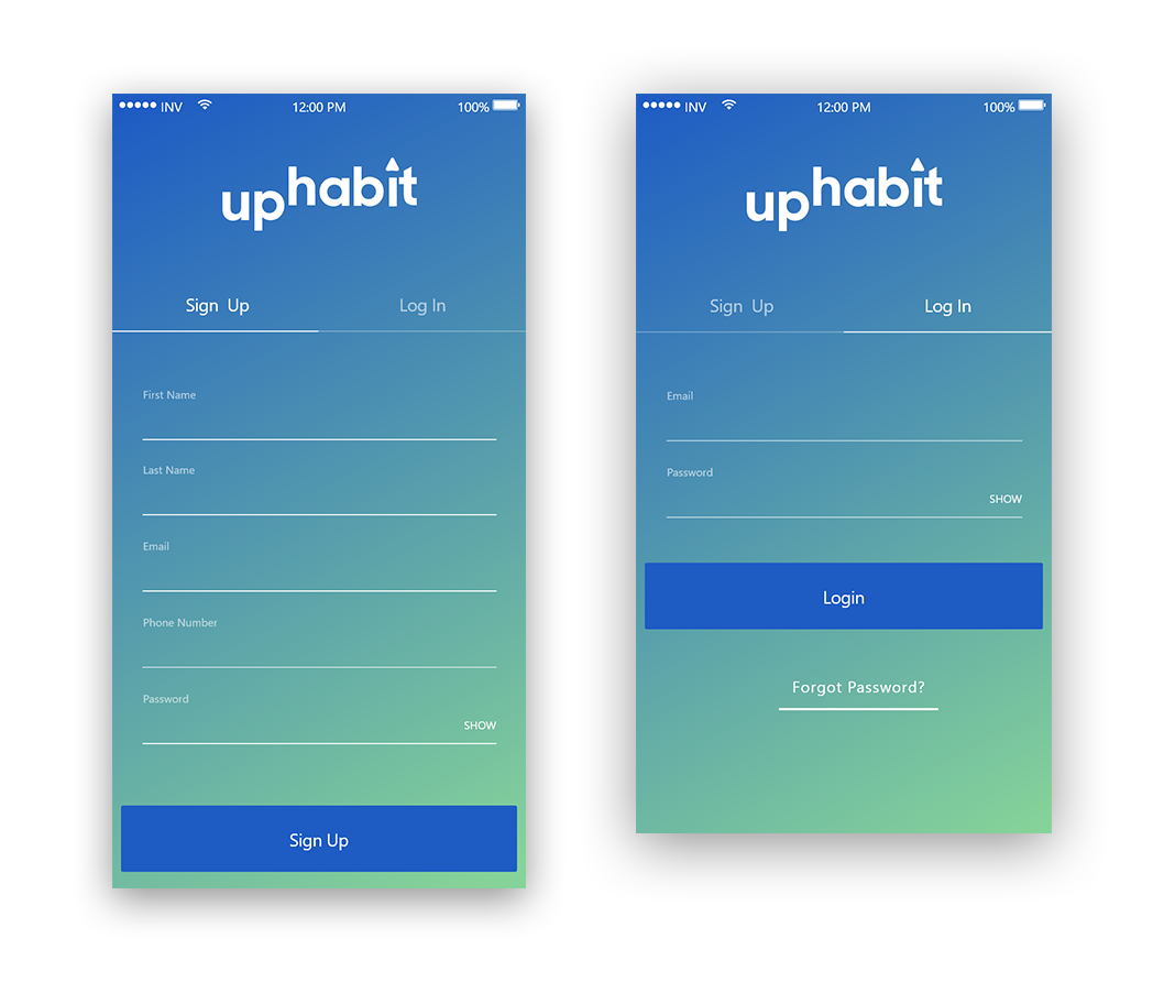
Current Design of the login and sign pages. Users found there to be too many fields on the sign up form, a simpler form was needed
The login/sign up screen had a blue/green gradient background which made reading form labels and validation messages difficult. The contrast ratio of white text to blue/green background also didn’t pass accessibility standards for low vision users.
The design below was created to address those issues.
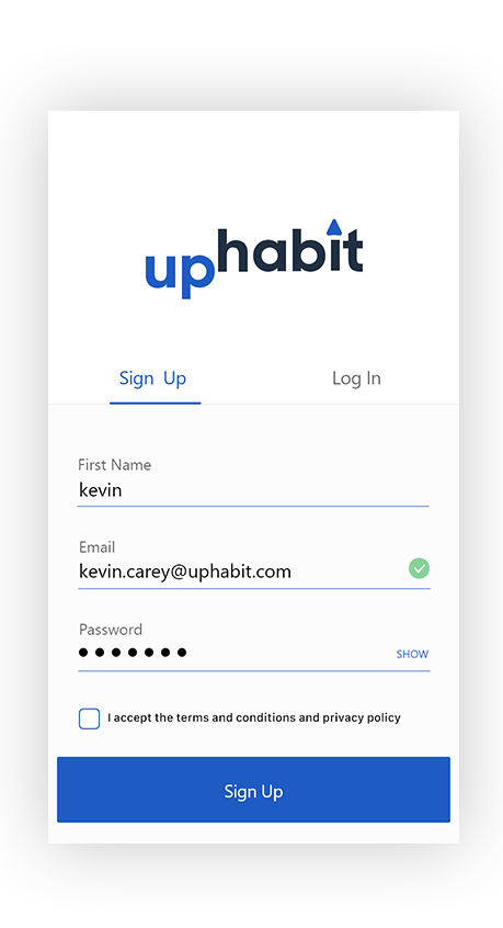
Updated Sign Up form. It is has improved legibility, less fields and clearer error/validation messages. A future version of this screen will include single sign on from google/Microsoft accounts.
Usability issues on the post sign up screens
When the user first creates an account there are a few steps that are needed in order to bring contacts into the app.
When the user first creates an account there are a few steps that are needed in order to bring contacts into the app.
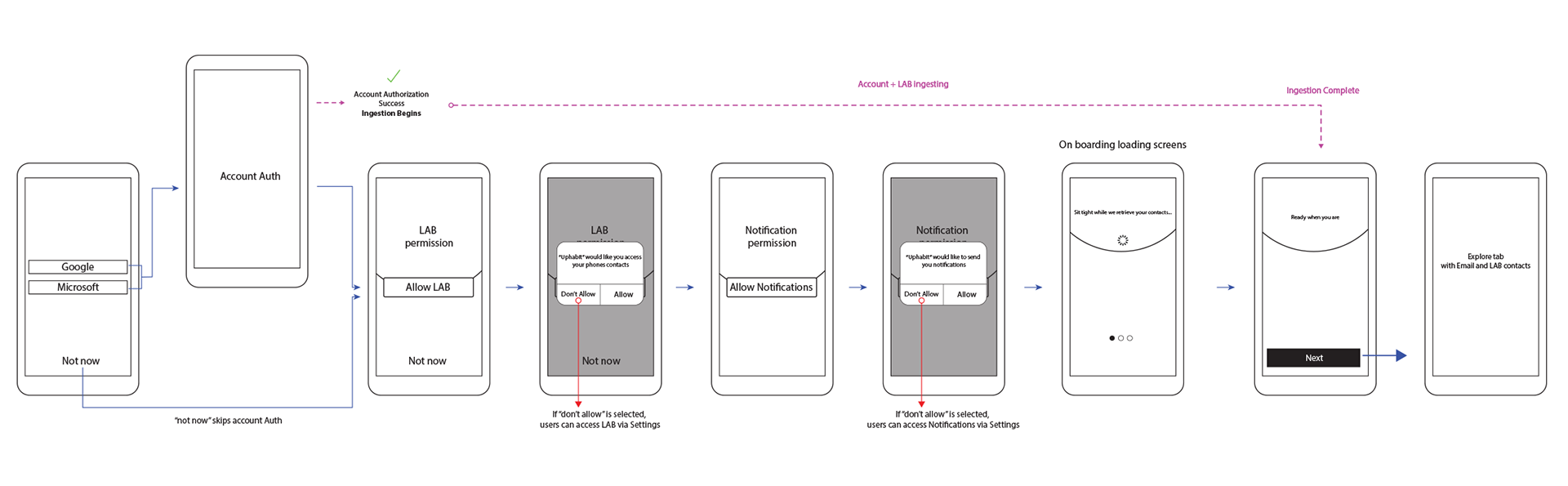
User flow diagram showing steps needed to grant the app access to contacts and allow notifications
The buttons to skip steps were located below the primary CTA button, which during usability tests, showed users had a difficult time finding. Typically, especially on iOS, these skip buttons are placed in the top right.
The content of the on boarding screens needed to provide more succinct information. The screens contained a fair amount of text and were too difficult for users to read quickly. Also, users didn't find the visual design too appealing
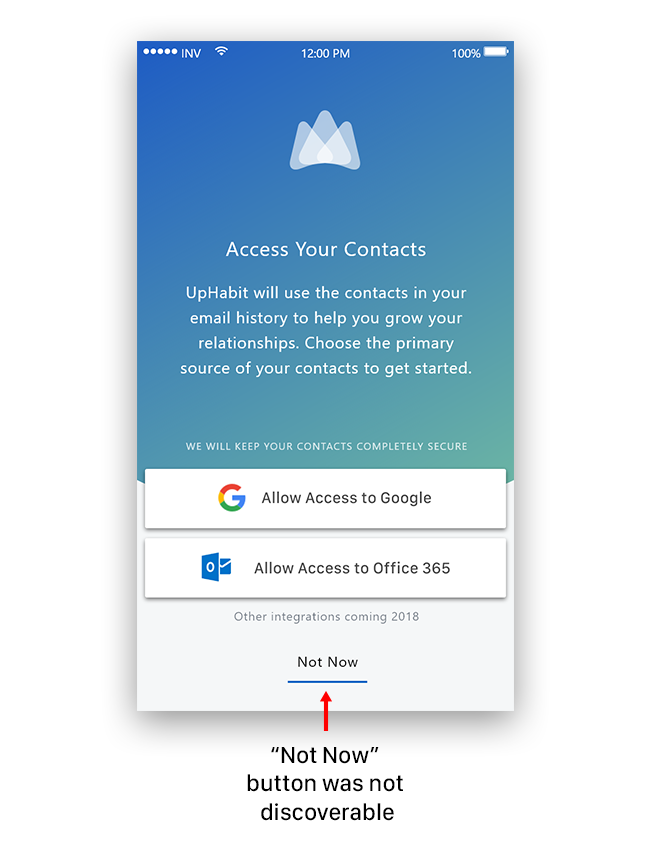
Example of an on boarding screen. Users had trouble skipping steps when they wanted to, the "Not Now" button was hard to find. The "Not Now" text wasn't always clear to users, using the word "skip" instead tested much better
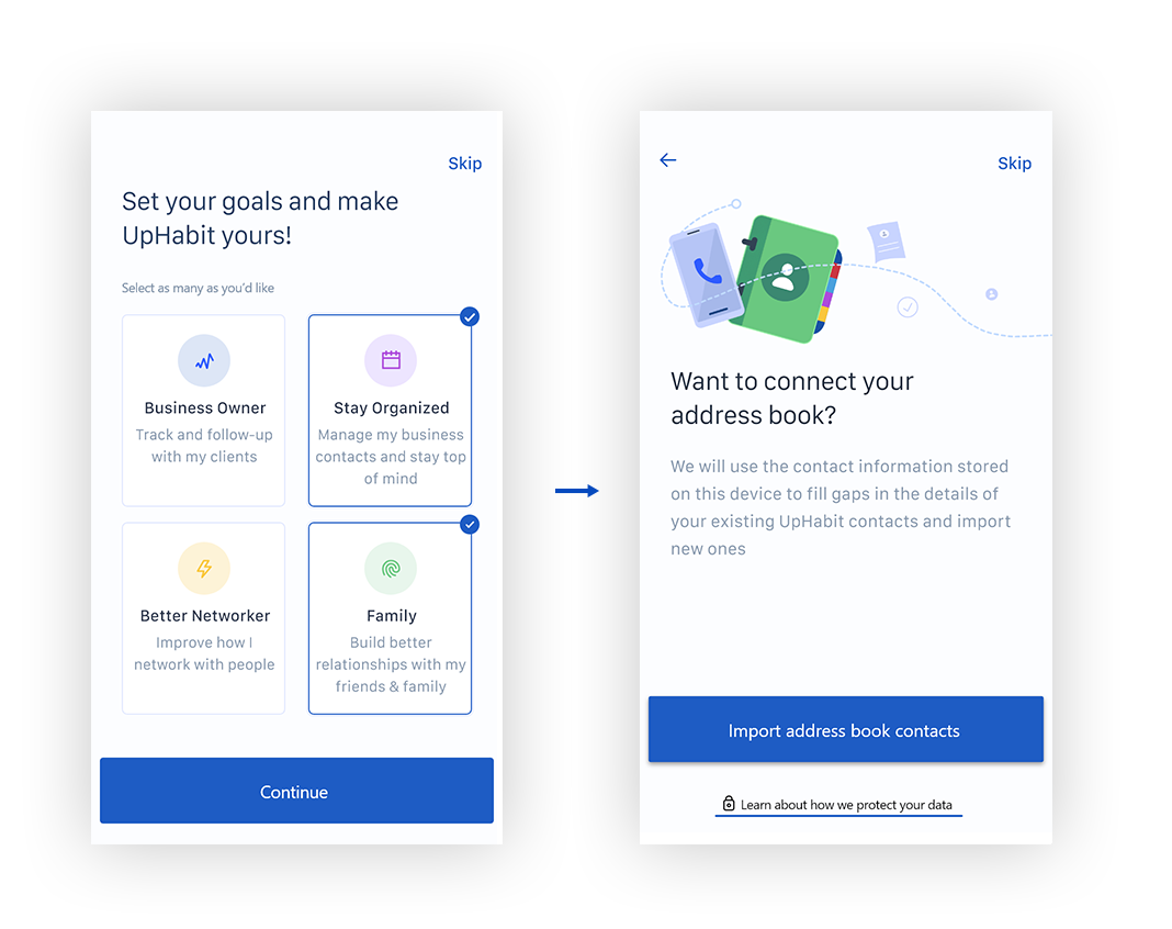
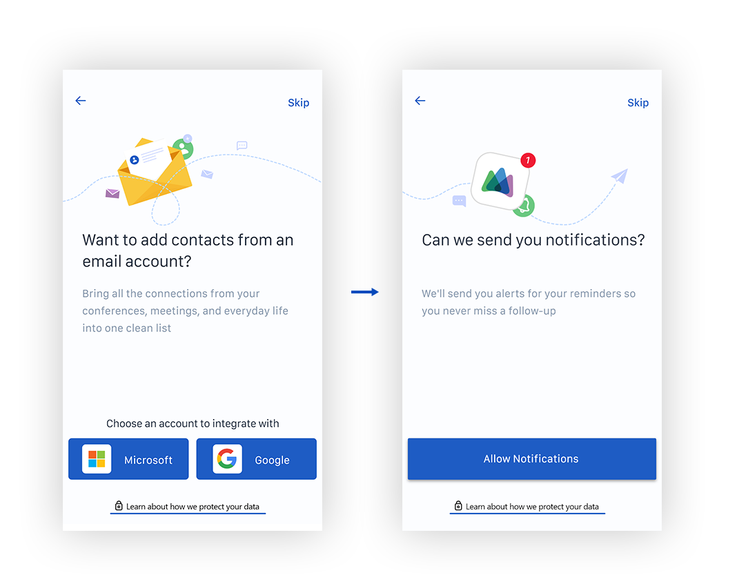
The redesign of the onboarding flow used illustrations that better explain what we were asking the user to provide us and the copy clearly stated why we needed that information
The first goal-setting step was added as an initial step towards adding gamification to the app. It also allows us to collect more data on why users were using the app as well as give them a sense of how the app could help them
I designed illustrations that helped make the app feel more friendly and approachable, as well as provided some context as to why we were asking for various permissions. The "learn about how we protect your data" link was added to address users concerns about privacy.
I designed illustrations that helped make the app feel more friendly and approachable, as well as provided some context as to why we were asking for various permissions. The "learn about how we protect your data" link was added to address users concerns about privacy.
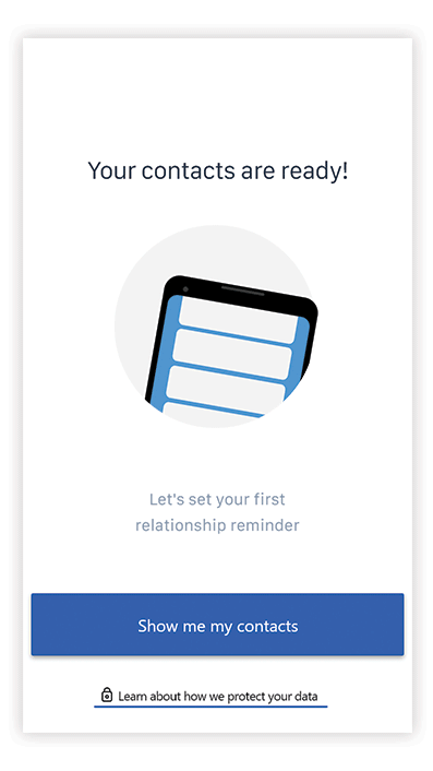
Example of an animation used to show when a user's contacts are successfully loaded into UpHabit
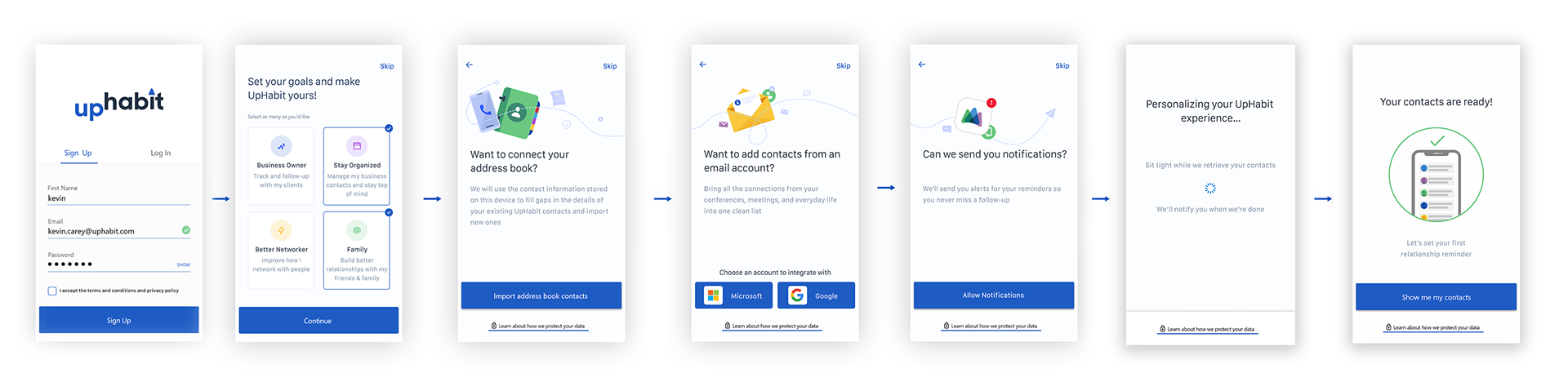
Full Onboarding flow
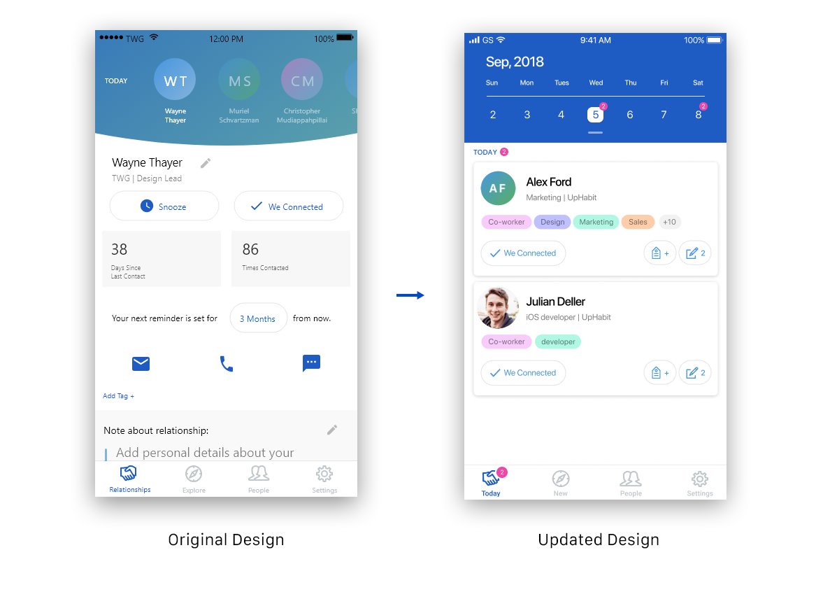
The "Today" screen acts as a daily to-do list of all the contacts you have scheduled to be reminded to connect with on that particular day.
During user testing, users found the horizontal scrolling of the top row of names to be difficult to use and didn't give them a clear picture of their weekly meetings. Also, by initially landing the user on a single person's contact page, users weren't entirely sure what actions needed to get taken there.
The updated design added a calendar view on the top of the page to allow users to easily see the number of weekly/monthly reminders at a glance. All the contacts that the user needed to reach out to that day are shown in a list view rather than individually.
New tab Updates
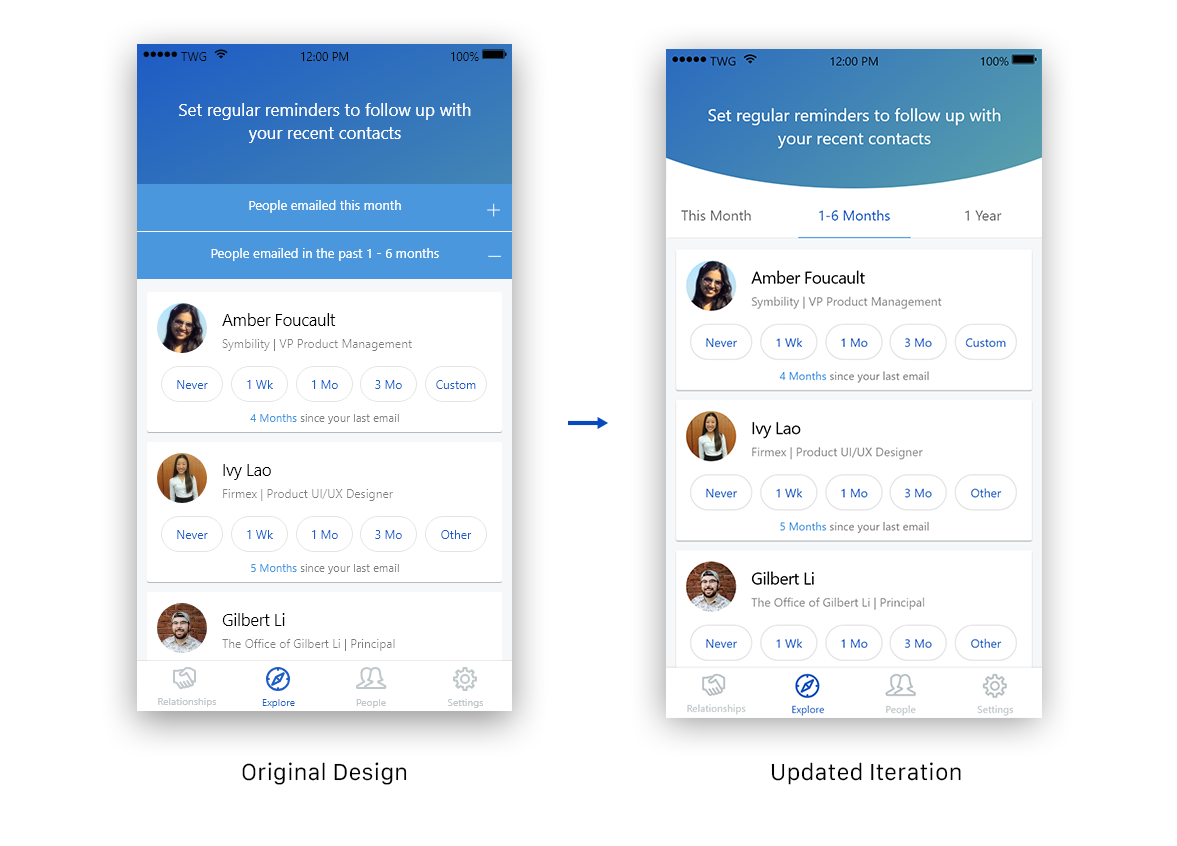
The New tab acts as a screen where any contact that you have emailed recently (and wasn’t a contact of yours before) will appear. The user will triage contacts by tapping a reminder time period ex. “3 mo” will set a reminder to contact this person every 3 months. When a reminder is set, the contact will be removed from this screen. Contacts from your past will also appear here and are sorted into various sections depending on how long ago you contacted them.
Originally, users had trouble navigating this screen because sections would expand or contract depending on what was selected. Some section dividers would be hidden from view if a user had too many contacts in the section and overall found the experience confusing. A quick iteration was made to change the layout to use a tab bar to improve navigation.
Original Design on the left with expandable sections to divide contacts. On the right, a design with a top tab bar to help user navigate this screen more easily
People tab updates
The “People” tab acts a place where all your contacts are stored. Users found the original design didn’t show enough contacts on a page, which also made searching for a contact harder as they could only view contact at a time when the keyboard was expanded. Ideas for an expanded and compact views were discussed to help solve these issues.
The “People” tab acts a place where all your contacts are stored. Users found the original design didn’t show enough contacts on a page, which also made searching for a contact harder as they could only view contact at a time when the keyboard was expanded. Ideas for an expanded and compact views were discussed to help solve these issues.
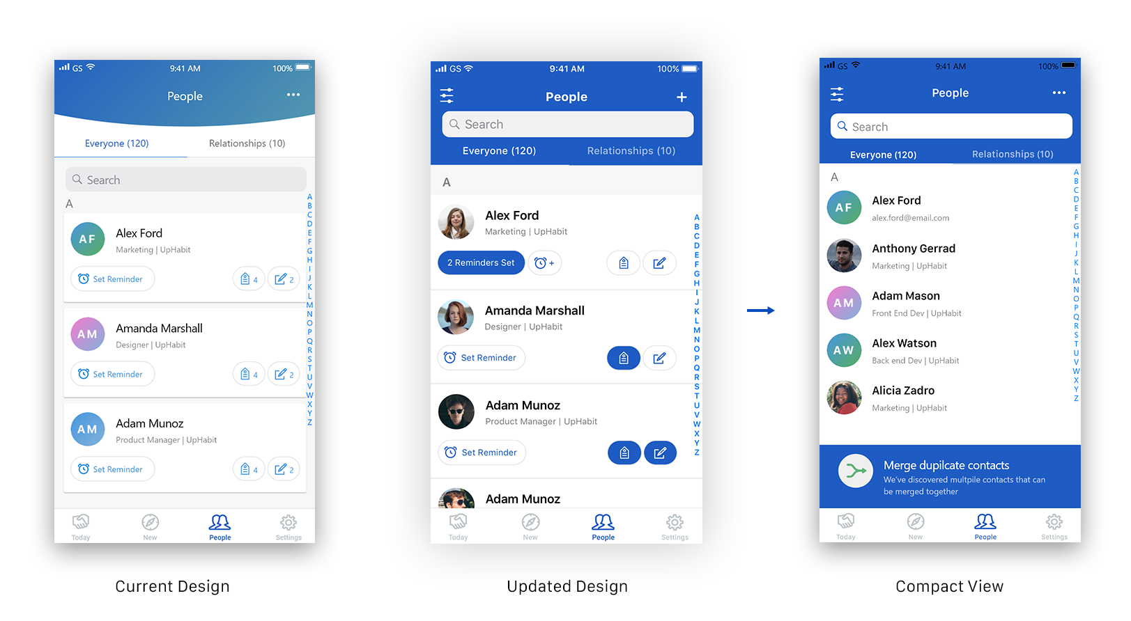
Examples of some iterations on the "people" tab. The compact view also shows the "merge duplicate contacts" feature that auto detects contacts that can be merged together
Uphabit currently has 10,000+ downloads on android and about 20,000+ downloads on iOS as of summer 2021
My Contributions to the Team
- Held frequent design reviews to help guide my design process
- Lead UX research efforts through user interviews, surveys and observational usability tests
- Held frequent design reviews to help guide my design process
- Lead UX research efforts through user interviews, surveys and observational usability tests